
The Opportunity
This initiative was sparked by an email from a long-standing Love Home Swap user who, after a life-changing bicycle accident, now relied on a wheelchair. While he wanted to continue travelling through the platform, the existing filters — like “wheelchair accessible” — didn’t provide enough detail or confidence to make informed choices.
Discovery interviews with other users in similar situations revealed that “accessibility” is highly individual. Some need step-free access, others wide doorways, or specific bathroom layouts. Most said they didn’t need ADA-compliant properties — they just needed accurate, visual, and detailed information to make their own decisions.
We also uncovered a gap in the market. While Airbnb has a fairly detailed accessibility breakdown, few peer-to-peer home swap platforms were offering this level of care. That insight, along with advice from a former Airbnb PM who’d built their accessibility flow, helped us craft a product plan tailored to the unique needs of our audience.
Discovery
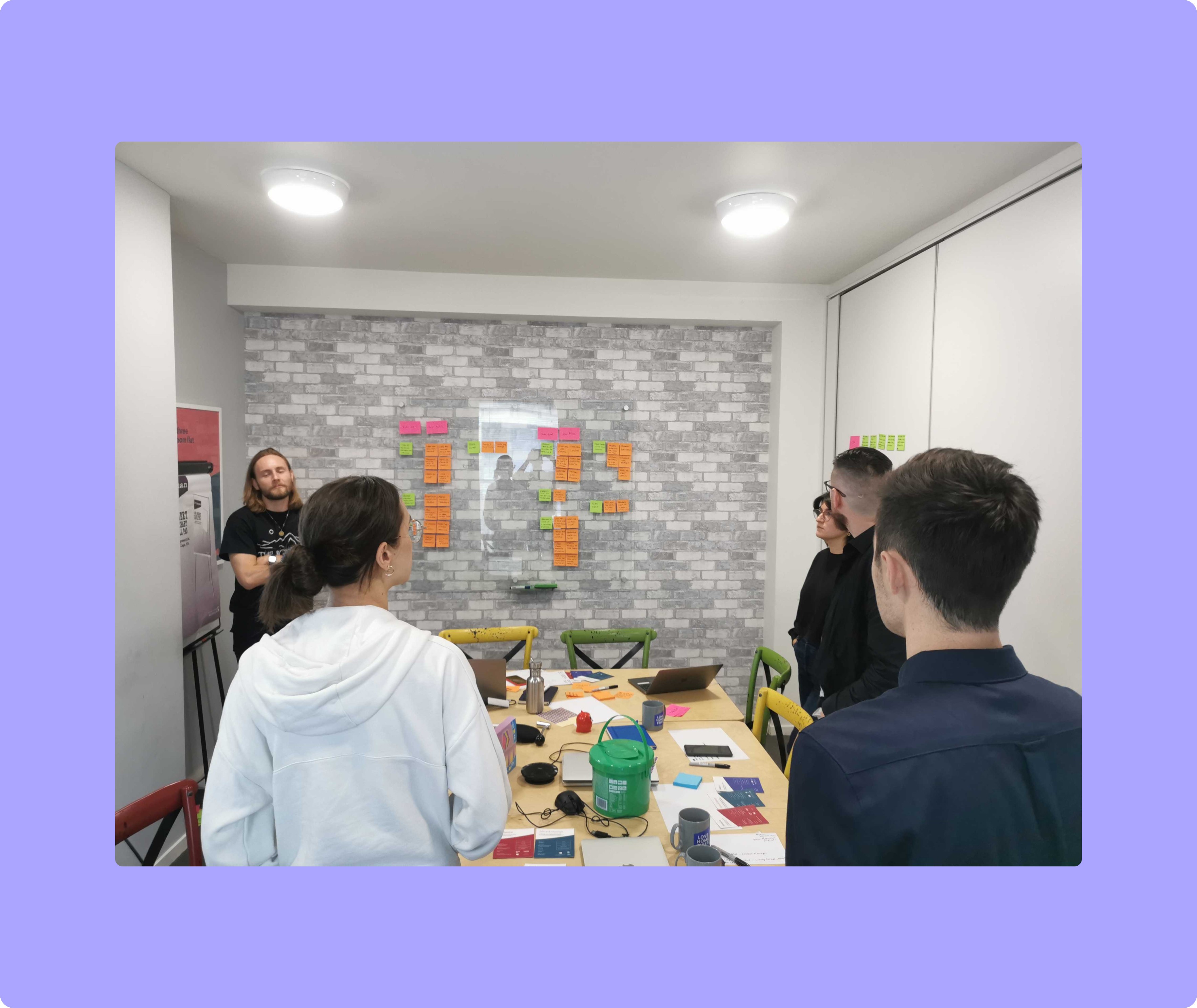
We kicked things off with a hybrid workshop using methods from the Google Design Sprint. The goal: understand the journey, the goals, and the barriers for both hosts and disabled travellers.
Key “How Might We” Statements
How might we gather enough inventory to give users real choice?
How might we guide non-expert hosts to add useful accessibility details?
How might we ensure hosts upload high-quality, accurate information and photos?
We also conducted interviews, competitor analysis, and accessibility reviews to shape our thinking. One clear insight was that hosts needed clear guidance and motivation, while guests needed transparent, visual detail — not vague labels.
Strategy & Hypothesis
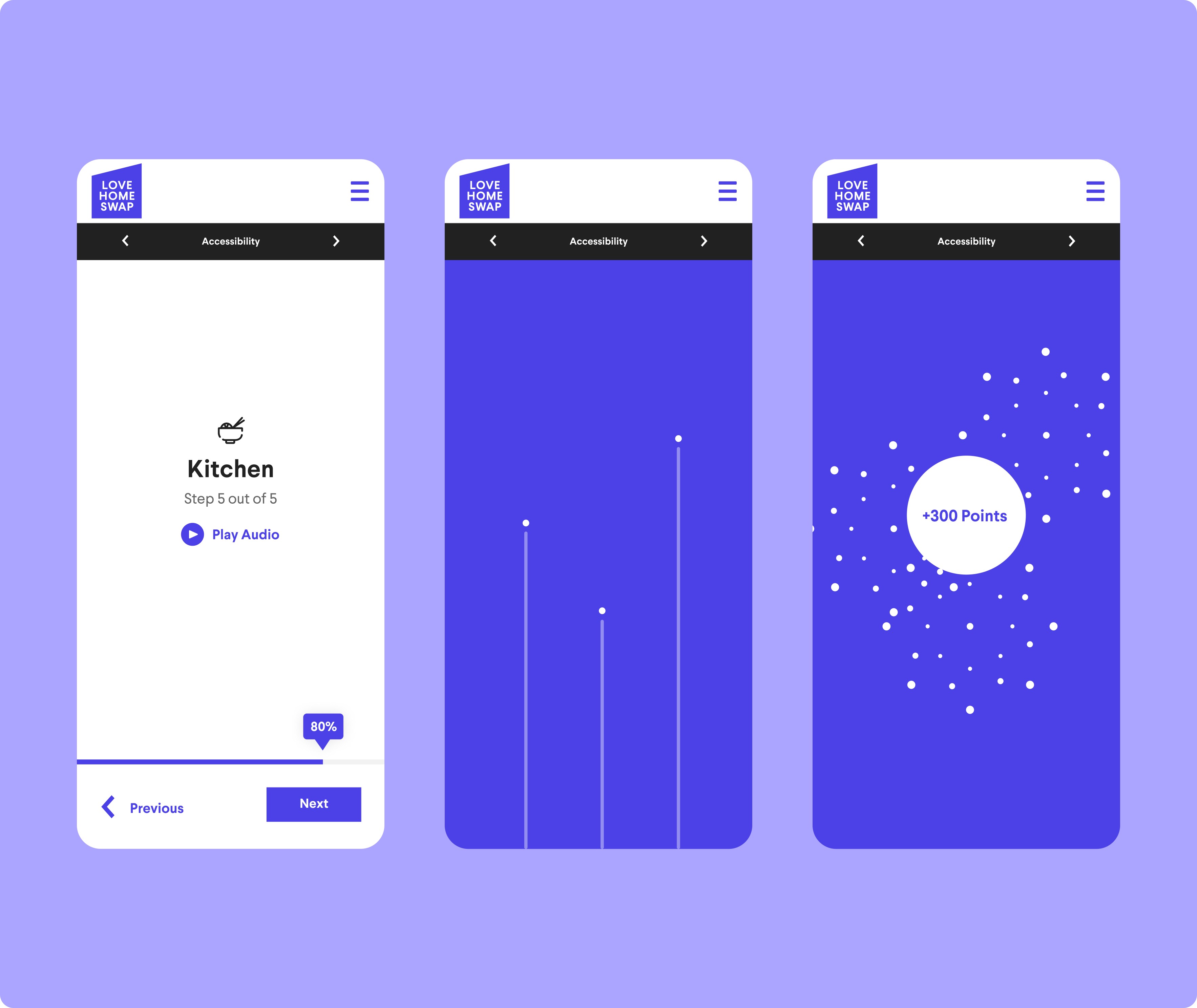
We hypothesised that a walkthrough-style form would best guide hosts through the process of adding accessibility features to their home listing. By making the experience simple, visual, and rewarding — and offering Points as an incentive — we could scale our accessible inventory.
We hypothesised that:
Hosts would be incentivised by a 200-Point reward.
Clear instructions would lead to high-quality photo uploads.
An optional audio guide could support accessibility for hosts, too.
Design Execution
I created low-fidelity wireframes to explore form flow, image capture, and motivation mechanics. After iterating internally, I moved to high-fidelity designs in Figma, optimised international users across all supported device sizes.
Modular walkthrough form, broken into easy-to-follow steps

Progress bar and celebratory end screen to keep users motivated
Transparent Guest Experience

Validation
We ran virtual field studies with hosts to validate our hypotheses. Sessions revealed several points of friction and new opportunities:
The audio guide was underused — users found it intrusive and unnecessary, so we removed it.
International users appreciated dual units, prompting a global-friendly copy update.
Some sections were over-explained, so we simplified copy and gave users the option to expand for more detail.
Celebratory micro-interactions (like “Well done!” cards) boosted motivation and completion rates.
Users responded positively to the idea of increased rewards, leading us to raise the Points offer from 200 to 300.
Results
The walkthrough was rolled out as a soft launch with positive early results:
+300 verified accessibility uploads within 6 weeks
Increased host engagement across underrepresented inventory
Completion rate of 74%, surpassing the average for listing updates
Positive feedback from users with mobility needs citing greater confidence in choosing homes
We also saw stronger internal advocacy for accessibility features and a clearer path for expanding the experience to other accessibility types (e.g., visual, auditory, neurodivergence).

